The VERIS A4 Grid
The A4 grid is a way to organize and visualize the main categories of actors, actions, assets, and attributes in the VERIS threat model. For more explanation on the “4 A’s,” see the Incident Description section of this wiki. If we calculate all the combinations of the high-level categories for each of the A's (3 Actors, 7 Actions, 5 Assets, and 3 Attributes), 315 possibilities emerge. These 315 A-A-A-A combinations form the intersections of the A4 Grid as laid out in the figure below.
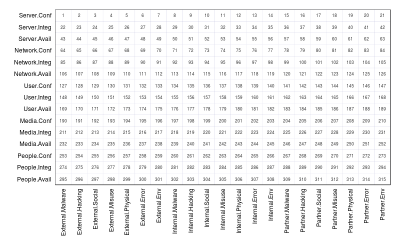
The numbers at each intersection provide a simple way to reference a particular combination of A's. For instance, #1 describes incidents that include an external actor, malware action, server asset, and confidentiality attribute at some point in the event chain. It does NOT necessarily mean that an external actor installed malware that compromised the confidentiality of a server (this is why nonsensical intersections like Malware-People still have #s). In other words, the intersections represent ASSOCIATIONS WITHIN AN INCIDENT, not a direct connection between those specific A's. Note that it is possible to create these direction connections through event modeling using VERIS, but that process is non-trivial and beyond most incident description/reporting needs.
Creating the grid
Understanding the basic structure of the A4 grid is one thing; populating it with data to use as a visualization tool is another thing entirely. Since many have asked about producing VERIS grid visualizations (e.g., Figure 6 in the 2013 DBIR), we'll briefly demonstrate how that's accomplished. Hopefully, it will get you moving down the right track if you want to crank out some of these for your own VERIS dataset.
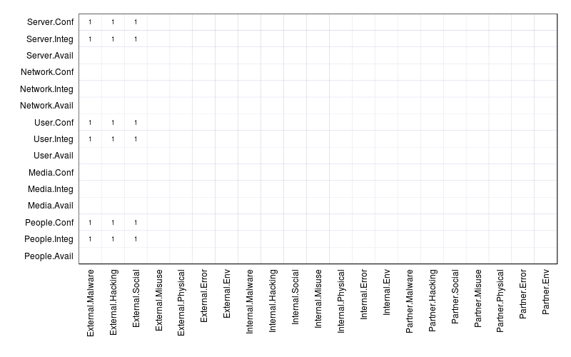
Suppose you “VERISized” the typical state-affiliated espionage breach. It may involve external actors, malware, hacking, and social actions, server, desktop, and people assets (maybe other categories too), and at least the attributes of confidentiality and integrity. If you associate all those possible combinations in grid form, you'd have something that looks like the figure below. Remember that this doesn't suggest that malware infected people or that the attacker socially engineered a server - it means those things were observed within the same incident (i.e., social tactics did, indirectly at least, contribute to the loss of confidentiality of a server).
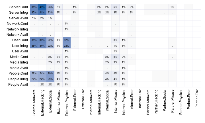
Now suppose you VERISized numerous incidents and wanted to see which A4 associations were most common across the dataset. Depending on your toolset, you'd set up some kind of routine that essentially “count the number of incidents that include external actors AND malware actions AND server assets AND confidentiality attributes, then divide that by total incidents.” We produced Figure 6 in the 2013 DBIR in similar fashion using R.
It's worth noting that it is *possible to create a grid based only on direct associations between the A's, but it's more time-consuming to collect and store incident data to allow this. This “event modeling” creates a progressive sequence of distinct threat events (similar to “kill chain” format). Examples and guidelines around event modeling using VERIS will be published at a later date for those interested in exploring it further.